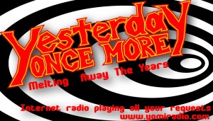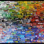
Taking a whole lot of bumper stickers from various radio stations provided by the client, I assembled this background. Seriously, he gave me so many of them that it actually took two weeks of long hours, diligent work, arranging and refining to get the colorful, transitional pattern here. Granted, some of that two weeks were playing with various designs, seeing if perhaps a mosaic forming another image might work. The flow of colors works really well in the finished product. He also needed a logo and we finally came up with this one that he was very happy with. As he said "I love it!" A very good thing to hear for a designer. I've got some more things I am working on involving this particular website, logo and such, but so far, things are going well. Done in Illustrator primarily with a little bit of photoshop work.
As a side note, here are what I was originally working with as far as logo and business card go (the two images with the more jagged red and yellow logo). I think they are interesting. Fun. Unpolished as they are just drafts. Not what the client wanted at all, but I still think they are alright. They're at least fun. This logo was hand done then colored in Illustrator.
And here's the bumper stick background without the logo just so that I can show off the pretty flow of colors I figured out how to get from the hundreds (thousands?) of bumper stickers.


