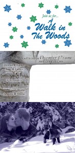
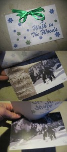
This was a wedding invitation project for my best friend. For the most part, I am very pleased with it and so were they. I love doing things like this. This was a fun project. Basically, I hate the typical Utah wedding invitation that consists of a large photo with three smaller photos placed on it somewhere with a couple photoshop effects that are used simply because they are there. Nothing is ever gridded (that is now a word) out properly, the colors have nothing complimenting them, they're either too busy or too empty with no real balance of anything and then they use a cliche poem in a script typeface that is completely unreadable and THEN they are always so generic. I look at wedding invitations as things with so much lost opportunity. An invitation should be a strong reflection of the couple. It should be able to portray them, who they are and invite people to their wedding (or other event) by nature of the people who's event it is.
Okay, to be specific on this project: The couple were doing a winter wedding with the theme "A Walk In The Woods." It was perfect for them as a couple. They are an active, outdoorsy couple for the most part and with the winter, near Christmas theme, it was actually very easy to sit with them and figure out how we could make an invitation that was very different from the often seen cliche. So we did a photo shoot up in the mountains, got some very cool photos of the two of them
Sadly, the printer we went through did not follow my instructions as well as they should have and screwed up on the color.
Explanation on the blue color: The photo was actually designed as a true duotone and was to be in their blue wedding color and although it looked(looks) funky on the monitor, it is actually correct when printed. True duotones can do that. My file was prepared correctly as a true duotone but I guess the printer that was used didn't know how to print these right. Oh well. They were still pleased enough with the end product, so it wasn't disastrous.
I won't be doing many multi-layered invitations like this though. Not the easiest thing to design. But it does look nice.
Things I learned from this project: 1) Ask the printer about their duotone printing capabilities. If they can't print it right, then make an alternate file that is a standard CMYK color to print from. 2) DON'T do multi-layer wedding invites. I could redo this much better now, but, no matter what I would do to the images themselves, the work to assemble them will be horrible. Don't create this much work for myself or a client.


