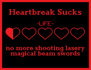
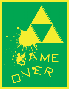
For a class assignment, we were to design 5 one color posters in Illustrator. I decided to go with a theme for all five and used the video game, Zelda as my inspiration. I’m quite happy with them all… well, the masks one is actually kinda garbage. Well, maybe it’s not too bad. Ah, it’s bad. Whatever. The margin color indicates the paper color that each poster is meant to be printed on with the other color being the theoretical, opaque ink we are printing with. I particularly like the white one green one, with the eye. The eye was hand drawn and then vectorized. Vectorized is a word, right? I had fun with the typography in it. I also like my green on yellow, Game Over poster. That one was quite fun to make. For some reason, the black on red, Heartbreak poster, made purely for the humor and not for any brilliant design choice, is most people’s favorite of the five.
Dec 23 2011


