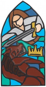
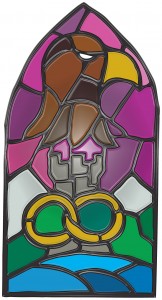
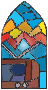
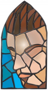
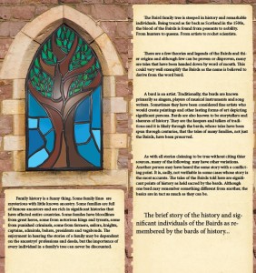
These images were drawn by hand initially. First in pencil, then outlined in pen. From there, they were taken in to Illustrator and turned in to vectors and colored. They were still pretty flat looking so I then took the vector images in to Photoshop and after some tweaking there, I acquired a sort of stained glass look. I don’t think they turned out too bad.
These were made for a student project. A zine of sorts. It was somewhat open ended as long as we matched a few specific criteria. I chose to do mine on my family history. The pages I created for the zine and how I made the stained glass illustration fit in to the stone window well was a problem. It was a stock photo of a window that I had to Photoshop in many ways just to get it sized right. Then the edges of the inside of the window well where the existing window glass was. That was interesting to deal with. Due to time, I was unable to do any more refining, but with what I had, I think it turned out quite well. I really like my stained glass windows. One, the tree, is sort of a leading image, setting the window theme. Next, the picture of the man facing against the boar and the one with the eagle, rings, and castle are both family story scenes. Then a picture of the TV with the wave of some sort; mostly a comical image to illustrate another person from my family history, John Logie Baird. Finally, I did a stained glass self portrait. Generally, I hate doing self-portraits, but I actually really like how this stylized thing came out.
Shown are the illustrations alone and one of them inserted in to the page of the book. It looks really nice printed.

